A Lowcountry Palette
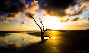
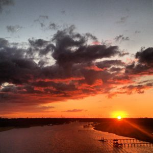
This morning, as I walked along the Battery, I met with a unique confluence of events that turns our waters a soft milky gray/blue, one of the beautiful colors of our Lowcountry palette. When you have a cloudy sky, very little wind, and the peak of high tide – our rivers hold their breath in a moment of contemplation, then go back to their business of falling and then rising again. It is in that breath that this color occurs.

It is not necessarily the colors of our brightly-painted homes or the intensity of our nearly year-round flora that make up our Lowcountry palette. Rather it is the blues of our skies, the grays of our weathered docks and the spring greens and winter golds of our marsh grasses….


So here’s my self-created Lowcountry palette from Sherwin Williams. In this order they are Fusion, Sleepy Blue, Social Butterfly and Dazzle. Perhaps I’ll do a room in this one day. So what’s your Lowcountry palette?


 Next Post